Saturday, 27 February 2010

Blogging again

So I've decided I'm going to start blogging again.

Hmmmmm....

Need to change the image, it certainly isn't summer right now!

Thursday, 2 October 2008

Time Traveler's Wife


I finished this book recently after being riveted to it for a good few days. The book follows Clare Abshire, and her husband Henry DeTamble, who met when Clare was 6 and Henry was 36, andmarried when Clare was 22 and Henry 30.

Henry has a very rare genetic disorder known as Chrono-Displacement that causes him to involuntarily travel through time. He is unable to control when he leaves, where he goes, or how long his trip will last. His destinations are tied to his subconscious, as Henry most often travels to places he has visited or will eventually visit. Very often, Henry is taken back to the moment his mother died in a car accident he survived, and is forced to observe the car crash again and again.

It sounds a bit 'sci-fi' gone wrong, but in fact it is intensely moving. They are both present in different era's each other's lives, and so help each other grow throughout the novel.

A film adaptation of the book staring Eric Bana and Rachel McAdams will be released in December, and I can't wait. 

Jules Vernacular


Jules Vernacular is the 'typo-pseudonym'  of French graphic designer Jack Usine. Some very nice bits of type are on his blog.
http://vernacular.free.fr/blog/index.php

Wednesday, 1 October 2008

Three Trees

I came across this group a while ago in CR.

I emailed one of the founders when researching for the Ted Baker environmental packaging D&AD brief (a brief I actually didn't end up doing), and was surprised to actually receive a very helpful and in-depth response. 

Their website is definitely worth a look, as there is practical advice on how to save money as well as the environment.

http://threetreesdontmakeaforest.org

Another 'Starry Night'

Pictures

I think that there are some works of art that you have to see up close and for real to 'get'.

Van Gogh's 'Irises' is one of them.

It was painted in the last year before his death, while he was at the asylum in St Paul-de-Mausole in Saint-Remy-de Provence, France. He called the painting "the lightning conductor for my illness", as he felt painting kept himself from going insane.

Inspired by Japanese woodblock prints with the strong outlines and unusual angles, I felt the painting was simply breathtaking - mainly due to the deepness of the blues, something that is done no justice in reproductions.
Similarly, in the same room as 'Irises' at the Getty Centre, LA, Monet's 'Haystacks' is housed. Its colour is also simply beautiful, colour that is also completely lacking in reproductions.

At the Getty Centre, I also was lucky enough to see David Hockney's famous piece 'Pearblossom Highway', a piece that has never failed to astound me. However, seeing the piece in the flesh gave me an even greater sense of wonder due to its sheer scale. It measure 198x282cm, filling a whole side of the room. Also, with the opportunity to see the piece so close, you can see all the very fine details in the photos and just how much work Hockney put into the piece.

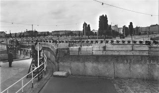
Checkpoint Charlie Museum


A stark contrast to the Warsaw Uprising Museum mentioned in my previous post, is the Checkpoint Charlie Museum in Berlin.

It opened just outside the Berlin wall in 1962 in an apartment with only 2 and a half rooms. But since it has been added to bit by bit to create a maze-like documentation of the wall as time went by. Similarly to the Warsaw Uprising Museum, it has a very personal feel but it is achieved more naturally (at the expense of being less organised and with less aesthetic value), housing stories of some of the people who were killed at the time of the wall, and people who escaped. 

Warsaw Uprising Museum


From a young age, I've been dragged around many a war museum due to my Dad's fascination with anything WW2. However, I found the Warsaw Uprising Museum a refreshing change. Opened in 2004, it is considered the most modern museum in Poland.

It is home to hundreds of artifacts relating to the struggle of the Polish people during the Warsaw Uprising in 1944, ranging from love letters to weapons and planes. The museum is full of tactile design, inviting the visitor to become involved, complimenting the written and spoken accounts of life in 1944.

There was also student art in the gardens surrounding the museum.

Historical museum design is never something I have really ever considered, but I was inspired by how the design of the exhibitions, and the building itself, really made the museum touching as well as interesting.


Sony Centre - Potsdamer Platz, Berlin


After WW2, Potsdamer Platz was left destroyed after originally being a bustling city centre, later becoming a wasteland - with only the Berlin wall as a landmark.

The Sony Centre was built in 2000, part of a redevelopment effort for the area. It contains a mix of shops, cinemas, restaurants, hotels, museums and offices.

Designed by Helmut Jahn (a German-American architect) the building is just stunning.

Stalin's 'Palace of Culture and Science'


A 'gift' from the Soviet Union to the people of Poland. The architecture is closely related to several similar skyscrapers build in the Soviet Union in the same era (such as the Moscow Kremlin), however the main architect incorporated Polish details into the project by traveling around Poland and noting its architecture - the monumental walls are headed with pieces of masonry copied from renaissance houses and palaces of Krakow and Zamosc.

The Polish people initially hated the building - considered a symbol of Soviet domination, and this feeling still exists today. Some Poles still feel that the building should be demolished. Slightly amusingly, it seems as though skyscrapers have been cleverly positioned to hide the 'Palace of Culture' from the skyline.

Reichstag - Berlin


The Reichstag in Berlin was constucted to house the Reichstag (the first parliament of the German Empire). It housed the Reichstag until 1933, until it was severly damanged in a fire. The Reichstag became the seat of the German parliament again in 1999 after a reconstruction by the British architect Norman Foster.

Often, I feel the contrast between 'old and new' can be forced, look and contrived. However the Reichstag is complimented by the modern additions, creating a tasteful clash of old/new.

Berlin World Time Clock


Located in Alexanderplatz in Berlin is their World Time Clock, erected in 1969 as part of the square's redevelopment and has become a popular meeting point. It a continually rotates showing the time throughout the globe.

Weighing 16 tonnes and 10 metres tall, it features a revolving cylinder with the world's 24 time zones bearing the names of major cities in each zone. The mechanism constructed in a way which enables the current time in each zone to be read.

The clock looks quite dated now, but I loved the textures on the metal and the way that the type has been cut out.


Calvin Klein shop front


Not the best photo, but I must admit I felt awkward taking a photo. This is the Calvin Klein store in the Trafford Centre.

The models in the window are actually people, occasionally moving to change position or a quick chat. 

Obviously installations like this are to raise brand profile, but as I said, it just made me feel awkward and slightly intimidated.


Wednesday, 10 September 2008

Advertising Concept Book: Think Now, Design Later

A book I've read over the summer - practical advice on a variety of topics, including putting together your porfolio, as well as a wide account of the best advertising campaigns over the past 20 or so years. Interestingly, all the illustrations are pencil-drawn, to allow the reader to focus on the concepts themselves.

Book - Fingerprint

A great book with a great variety of projects using a variety of media. Guaranteed inspiration.

Some amusing Japanese signage...


http://www.tokyometro.jp/anshin/kaiteki/poster/index.html

Friday, 29 August 2008

Conor Oberst solo album

So I only half listened to this album once (in the car, on the way) before I saw Conor Oberst in Manchester this week, and so I (like everyone else there) was hoping he'd play something... anything off 'I'm Wide Awake, It's Morning' (he even seemed to tease us with hammer-ons sounding very much like 'First Day...').. and of course he didn't play anything. But he did properly introduce me to this superb album, played extremely tightly with his band. Upbeat tracks such as "Souled Out!!!" and "Get-Well-Cards" sit nicely within the more Bright Eyes formulated eerie songs such as the magnificent "Money Lenders" and "Canaveral".

http://www.manchestereveningnews.co.uk/entertainment/music/live_reviews/s/1064685_conor_oberst__academy_2

Here's a pretty accurate review, overlooking the Ryan Adams reference of course...

Tuesday, 19 August 2008

Bike racks

When Ex-Talking Head, David Byrne, a keen cyclist was asked by the Department of Transportation  to help judge a design competition for the city’s new bike racks, he eagerly agreed — so eagerly, in fact, that he sent in his own designs as well - which they used!

Simple but nicely communicate a characteristic of NY districts.


http://www.nytimes.com/2008/08/09/arts/design/09bike.html?_r=3&scp=2&sq=david%20byrne&st=cse&oref=slogin&oref=slogin&oref=slogin

Flat53

http://www.flat33.com

Saturday, 16 August 2008

Hann would be proud..

There was a variety of art on show  at Siggraph, from motion work, to textiles, photogrpahy, as well as geometric/systematic arts.

Craig S. Kaplan http://www.cgl.uwaterloo.ca/~csk/

"His work breaks the process of pattern construction into two steps. First, the designer chooses a tiling of the plane. Then the software places small geometric motifs in every tile, a process governed by a small set of parameters under the designer’s control. The motifs link together to form a finished design. The computer handles the tedium of precise, repetitive drawing, thus freeing the human designer to explore the space of star patterns quickly and enjoyably."


If only we had it for Design Theory assignments...


Star Wars - Clone Wars animated

Ok so it's Star Wars but bear with me..

As I mentioned, LucasArts had a stand at Siggraph and I sat in on a few of their talks; it was really interesting to hear about the whole development process - from concept art, through development and the finished product. How they changed the characters - emphasising the physical heroic traits, eg. highering the waist and broadening the shoulders. They worked towards a real stylisted visual for the film and tv series - sometimes going back and getting rid of work when they found that the characters were looking too 'realistic'. I found this real clear vision of what they wanted to achieve, fascinating. 

They talked about how as each episode was completed, the bar was raised. The budget originally allowed for one or two characters, and one new world  per episode.In the end they were creating numerous vast environments and characters, all starting from 3d physical models. The director then looked at the model, working out what shots and angles he wanted and set the animators to work on creating the whole environment in 3d.

My favourite thing about the look of the film/tv series is that all the textures are hand painted before being placed over the 3d gradients, giving the characters, vehicles and environments a real 'comic-book' look.. that I think really works to create something new and exciting from a used formula.


Friday, 15 August 2008

Siggraph 08

  
 I was lucky enough to go to the Siggraph convention in LA this week (Special Interest Group on GRAPHics and Interactive Techniques).  

Stalls from companies such as Sony, Intel, Google were there as well as animation, film and games design like Disney, Pixar, LucasArts, Activsion, Laika, Digital Domain and Soft Image. A variety of different art pieces were on show too. The next few post will be stuff I saw there

Oh and I had lunch on Adobe too!


The website isn't great but here it is anyway..

http://www.siggraph.org/s2008/

Everyone makes mistakes..!

I saw this on the bbc site today. About 720,000 pamphlets praising Brummies for their recycling were sent around the city at a cost of £15,000 (curious in itself!)

But the skyline image used was actually one of Birmingham, Alabama, USA...

It took a resident who received the pamphlet to realise that the image was wrong. Initially, the council claimed no mistake had been made and the "generic skyline [was] intended to symbolise an urban area".. they later admitted they had made a mistake. Ha!

Monday, 11 August 2008

LA Architecture


I really like the architecture in LA. It reminds me of the 'Splash' series by David Hockney - the geometric lines. Below are some pictures I've taken. There's also great variety though, in between these modern geometric structures will be a quaint old beach house.


Sunday, 10 August 2008

Upper Playground

I came across Upper Playground in a bookshop over here. There's a 12 different designers from over the US and a couple from Chile, Japan and Brazil, and so there is quite a variety in the artwork. There's loads more on their website that is definitely worth a look.

http://www.upperplayground.com


237


I watched Princess Mononokee (another masterpiece by Studio Ghibli) tonight, which is well worth watching just for these little characters.


I googled them to then find out about 237, an urban art project started in Spain, who have left these guys around their streets.


I like how they subtley use their environment to work with the character outlines.. having them sat on the curb, or drooling over the nearby fruit... as ambient media should


http://www.woostercollective.com/2005/02/237.html